If you’ve not heard of TailwindCSS, you’re missing out.
It’s a utility framework - super light weight, easy to learn, and absolutely awesome.
I’ve been using Tailwind for all my recent projects, and most of my projects are data-driven web applications, with buttons as such.
Now if you’ve worked with Bootstrap, you’re probably used to creating buttons like this
<button class="btn btn-primary">Primary</button>
and out would pop a button like this:
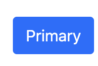
This is pretty straight-forward, and I liked being able to remember that if I needed a button, I just had to remember a couple of quick classes to make it how ever I want.
TailwindCSS, out of the box, doesn’t do this for you - but it’s super easy to do it for yourself.
For my Laravel Projects, when I use the TALL stack preset (TailwindCSS, AlpineJS, Laravel, Livewire), it creates your Sass file like this:
/**
 * This injects Tailwind's base styles, which is a combination of
 * Normalize.css and some additional base styles.
 */
@tailwind base;

/**
 * Remove the default box-shadow for invalid elements to prevent
 * inputs in Livewire components showing with a
 * red border by default in Firefox.
 */
input:invalid, textarea:invalid, select:invalid {
    box-shadow: none;
}
/**
 * This injects any component classes registered by plugins.
 */
@tailwind components;
/**
 *  CUSTOM CLASSES/COMPONENTS HERE
 */


/**
 * This injects all of Tailwind's utility classes, generated based on your
 * config file.
 */
@tailwind utilities;

[x-cloak] {
    display: none;
}
Then after you compile with npm, then it pushes all this into your application.
So - to do something that makes Tailwind buttons as easy as Bootstrap Buttons, I throw in these custom components
.btn {
    @apply inline-flex items-center border font-medium transition ease-in-out duration-150 justify-center;
}

.btn:focus {
    @apply outline-none;
}

.btn-xs {
    @apply px-2.5 py-1.5 text-xs leading-4 rounded;
}

.btn-sm {
    @apply px-3 py-2 text-sm leading-4 rounded-md;
}

.btn-base {
    @apply px-4 py-2 text-sm leading-5 rounded-md;
}

.btn-lg {
    @apply px-4 py-2 text-base leading-6 rounded-md;
}

.btn-xl {
    @apply px-6 py-3 text-base leading-6 rounded-md;
}

.btn-white {
    @apply border-gray-300 bg-white text-gray-700;
}

.btn-white:focus {
    @apply border-blue-300 shadow-outline-blue;
}

.btn-white:hover {
    @apply text-gray-500;
}

.btn-white:active {
    @apply text-gray-800 bg-gray-50;
}

.btn-primary {
    @apply border-transparent bg-indigo-600 text-white;
}

.btn-primary:focus {
    @apply border-indigo-700 shadow-outline-indigo;
}

.btn-primary:hover {
    @apply bg-indigo-500;
}

.btn-primary:active {
    @apply bg-indigo-700;
}

.btn-danger {
    @apply border-transparent bg-red-600 text-white;
}

.btn-danger:focus {
    @apply border-red-700 shadow-outline-red;
}

.btn-danger:hover {
    @apply bg-red-500;
}

.btn-danger:active {
    @apply bg-red-700;
}

.btn-secondary {
    @apply border-transparent text-indigo-700 bg-indigo-100;
}

.btn-secondary:focus {
    @apply border-indigo-300 shadow-outline-indigo;
}

.btn-secondary:hover {
    @apply bg-indigo-50;
}

.btn-secondary:active {
    @apply bg-indigo-200;
}
Then you can make super easy, and great looking buttons that look like this:
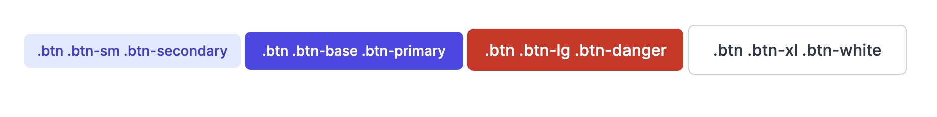
And it’s easy to add in what ever other colors or sizes you want eg:
/* For a new color use this */
.btn-blue {
    @apply border-transparent bg-blue-600 text-white;
}

.btn-blue:focus {
    @apply border-blue-700 shadow-outline-blue;
}

.btn-blue:hover {
    @apply bg-blue-500;
}

.btn-blue:active {
    @apply bg-blue-700;
}

/* For a new size use this */
.btn-really-big {
    @apply px-10 py-8 text-lg leading-7 rounded-md;
}